Redesigning the Activation Experience
Many new users completed onboarding but never made their first deposit or exchange, I redesigned the activation experience through data-driven experiments that guided users towards the next best action. This resulted in an 8.9% increase in first deposits and an 11.8% increase in first exchanges.
project role
Product Designer
Status
Live
Year
2026

Problem
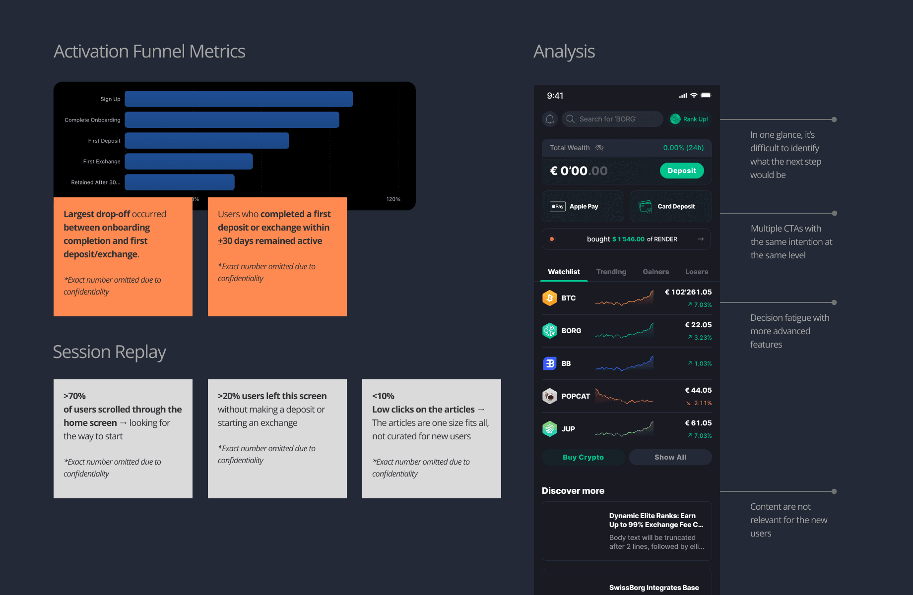
Many new users completed onboarding but never made their first deposit or exchange, despite these being strong indicators of long-term retention. Analysis suggested the Home screen overwhelmed beginners, making it difficult to understand the next step after onboarding.
Process
Working closely with the Product Manager and Data Analyst, I analysed activation funnels, session replays, and competitor experiences to understand user behaviour.
We identified key friction points, formed hypotheses, and validated them through iterative A/B tests, refining the experience every two weeks based on user behaviour and experiment results.

Outcome and impact
Rather than redesigning the entire Home screen, we focused on guiding users toward one clear next action. We simplified competing calls to action, introduced milestone-based guidance, surfaced beginner-friendly content, and prioritised the actions most closely linked to long-term retention.


reflection
This project reinforced that improving growth isn't always about redesigning the interface—it's about understanding user behaviour and validating decisions through experiments.
By focusing on one hypothesis at a time, we delivered measurable improvements while building confidence in the solution before investing in larger design changes.
Redesigning the Activation Experience
Many new users completed onboarding but never made their first deposit or exchange, I redesigned the activation experience through data-driven experiments that guided users towards the next best action. This resulted in an 8.9% increase in first deposits and an 11.8% increase in first exchanges.
project role
Product Designer
Status
Live
Year
2026
Problem
Many new users completed onboarding but never made their first deposit or exchange, despite these being strong indicators of long-term retention. Analysis suggested the Home screen overwhelmed beginners, making it difficult to understand the next step after onboarding.
Process
Working closely with the Product Manager and Data Analyst, I analysed activation funnels, session replays, and competitor experiences to understand user behaviour.
We identified key friction points, formed hypotheses, and validated them through iterative A/B tests, refining the experience every two weeks based on user behaviour and experiment results.
Outcome and impact
Rather than redesigning the entire Home screen, we focused on guiding users toward one clear next action. We simplified competing calls to action, introduced milestone-based guidance, surfaced beginner-friendly content, and prioritised the actions most closely linked to long-term retention.
reflection
This project reinforced that improving growth isn't always about redesigning the interface—it's about understanding user behaviour and validating decisions through experiments.
By focusing on one hypothesis at a time, we delivered measurable improvements while building confidence in the solution before investing in larger design changes.